IBM DB2
IBM Db2 Warehouse on Cloud is a fully-managed cloud data solution designed to help businesses manage their workflow in a more intuitive, user-friendly way. As a critical component of IBM's cloud portfolio, it serves Fortune 500 companies managing petabytes of data, enabling data scientists, analysts, and database administrators to get a comprehensive view of their data flow and usage.
Contribution: When I joined the project in 2019, this powerful platform was hidden behind an outdated, confusing interface that was actively driving customers away. What followed was a complete reimagining that would earn international recognition and set new standards for enterprise UX.
YEAR
2019-2022
Role
Senior UX Designer
RECOGNITION

YEAR
2019-2022
Role
Senior UX Designer
RECOGNITION
YEAR
2019-2022
Role
Senior UX Designer
RECOGNITION

Context
Context
The Crisis We Faced
When I first logged into Db2 Warehouse on Cloud, I understood immediately why customers were abandoning the platform:
By the Numbers:
NPS Score: -15 — Among the worst in IBM's portfolio.
340+ support tickets monthly — Mostly about basic navigation.
45+ minutes to complete simple scaling operations.
67% user drop-off during critical workflows.
7 levels deep navigation with 45+ menu items.
Behind these metrics were real people struggling daily. As one database administrator told me during research: "I need to scale resources 3-4 times a week, but I dread it every time. It's like finding a needle in a haystack."
Managing data flow and usage was labor-intensive and time-consuming. Users had to rely mostly on manual labor to sift through huge amounts of data. The existing interface forced them to look for their key information across various locations, making it nearly impossible to get a comprehensive view of their system's health.
Business Impact
The poor UX wasn't just frustrating users—it was threatening IBM's position in the cloud data market:
Customers defecting to Snowflake and Amazon Redshift.
$3M+ annual support costs eating into margins.
Negative impact on IBM's broader cloud adoption strategy.
Challenge
Challenge
Understanding the Problem
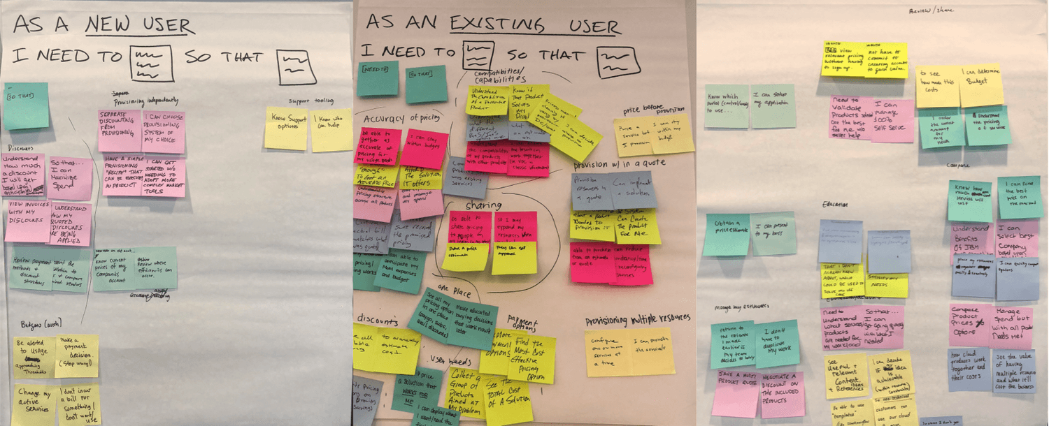
Deep Dive with Database Administrators
I began by getting to know the DBA persona, conducting:
15 in-depth interviews with database administrators from JPMorgan Chase, Walmart, ExxonMobil, and other Fortune 500 companies.
5 contextual inquiry sessions observing users in their actual work environments.
Survey of 200+ users to quantify pain points.
Analysis of 1,000+ support tickets to identify patterns.
Key Insights:
The research revealed that users were constantly monitoring high-volume streams of data, struggling to keep data organized, monitor incoming requests, and troubleshoot issues. All of these problems were causing bottlenecks and system shutdowns for businesses.
"The dashboard is the gateway drug for me...but if it's always pretty, then I don't look at it. It needs to show when there's a problem." — Study Participant 14
Strategic Alignment & Visioning
Executive Workshops: Setting the North Star
Before diving into design, I facilitated strategic workshops with C-suite executives and product leadership to understand the broader business context and align on modernization goals.
Executive Strategy Sessions:
2-day workshop with SMEs and executive stakeholders.
Business context mapping — Understanding Db2's position in IBM's cloud portfolio.
Competitive analysis review — How we were losing to Snowflake and Amazon Redshift.
ROI modeling — Quantifying the cost of poor UX on revenue and retention.
Vision alignment — Defining what "modernization" meant for enterprise data management.
SME Deep Dives: Understanding Technical Constraints
I conducted intensive workshops with subject matter experts to grasp the technical complexities we needed to simplify:
Technical Workshop Participants:
Database architects (understanding scaling limitations).
MLOps engineers (exploring auto-scaling possibilities).
Security experts (maintaining compliance requirements).
Support engineers (identifying top pain points).
Field engineers (customer implementation challenges).
Workshop Outcomes:
Identified 15 technical constraints that couldn't be changed.
Found 23 artificial barriers we could eliminate.
Mapped dependencies across IBM Cloud ecosystem.
Created modernization roadmap balancing quick wins with long-term transformation.
The Breakthrough Insight:
DB2 Warehouse on Cloud users needed to scale resources frequently but were avoiding it because navigation was so painful. By redesigning resource scaling as a simple 3-step visual workflow with plain language and real-time cost implications, we could eliminate the majority of support tickets overnight.
"Pricing is nice to see inside the product. Transparent up front rather than customers being surprised." — Study Participant 15
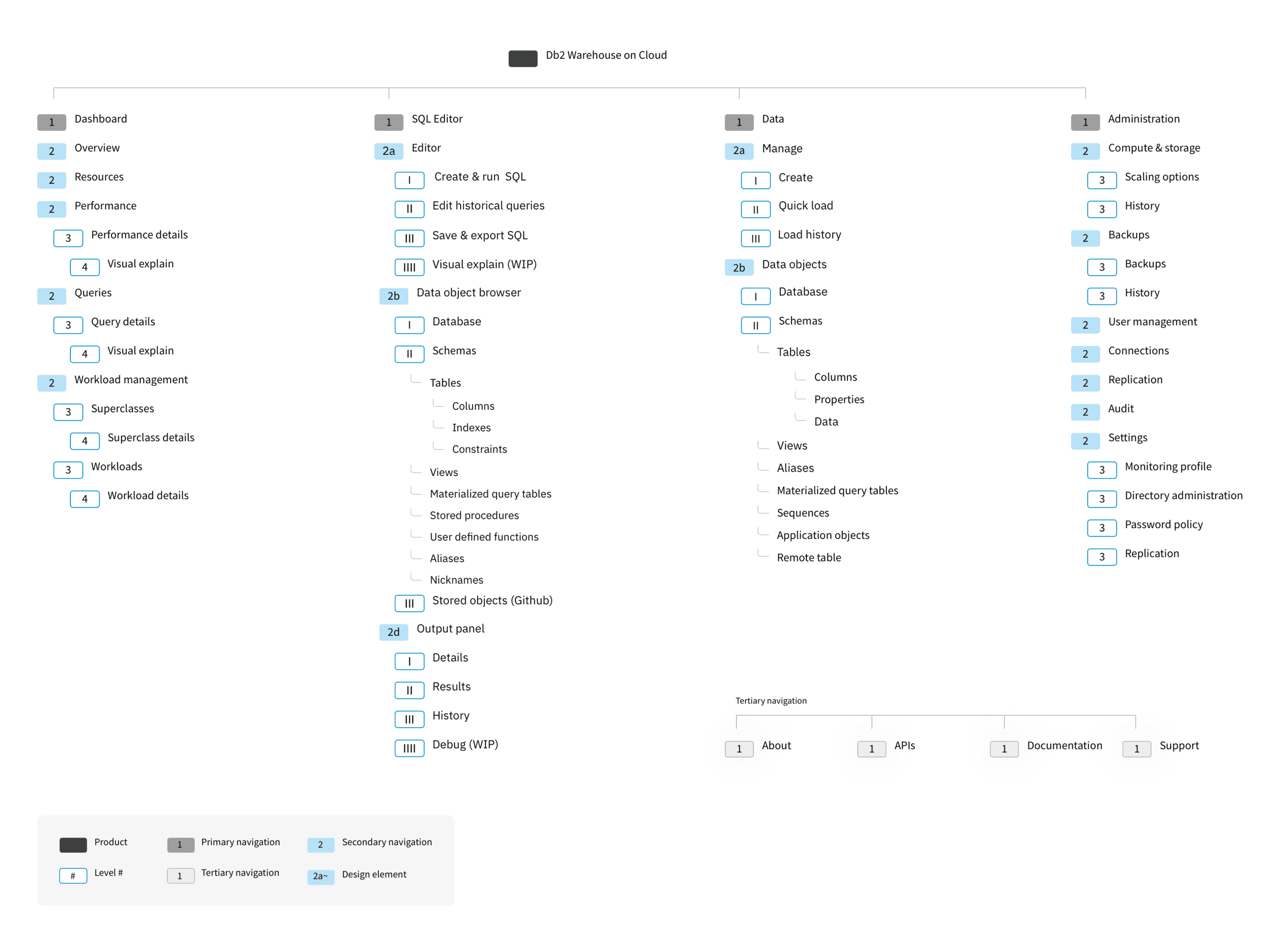
Restructuring for Intuitive Navigation
The existing IA was a maze — 7 levels deep with 45+ scattered menu items. Critical features like scaling were buried under "Administration > System > Resources > Management > Scale." I led a complete restructuring to make information instantly accessible.
Research & Validation:
Card sorting with 25 participants.
Tree testing with 40 users.
First-click testing to ensure discoverability.
The New Architecture:
Primary Navigation (5 Core Areas):
Overview — Dashboard with system health.
Resources — Compute, storage, scaling, backups.
Performance — Real-time monitoring.
Queries — SQL editor with visual explain.
Workload — Resource allocation.
Key Improvements:
Elevated "Run SQL" from buried feature to primary access.
Consolidated all data management (Tables, Views, Schemas) under unified "Data" section.
Grouped system administration logically (scaling + backups together).
Added Slack integration for alerts.
Visual notifications (bell icon with progress indicator) for ongoing operations.
Drill-Down Example: Data → Tables → Specific Table → Properties/Columns/Load History (Previously required navigating through 7 different menus).
Understanding the Problem
Deep Dive with Database Administrators
I began by getting to know the DBA persona, conducting:
15 in-depth interviews with database administrators from JPMorgan Chase, Walmart, ExxonMobil, and other Fortune 500 companies.
5 contextual inquiry sessions observing users in their actual work environments.
Survey of 200+ users to quantify pain points.
Analysis of 1,000+ support tickets to identify patterns.
Key Insights:
The research revealed that users were constantly monitoring high-volume streams of data, struggling to keep data organized, monitor incoming requests, and troubleshoot issues. All of these problems were causing bottlenecks and system shutdowns for businesses.
"The dashboard is the gateway drug for me...but if it's always pretty, then I don't look at it. It needs to show when there's a problem." — Study Participant 14
Strategic Alignment & Visioning
Executive Workshops: Setting the North Star
Before diving into design, I facilitated strategic workshops with C-suite executives and product leadership to understand the broader business context and align on modernization goals.
Executive Strategy Sessions:
2-day workshop with SMEs and executive stakeholders.
Business context mapping — Understanding Db2's position in IBM's cloud portfolio.
Competitive analysis review — How we were losing to Snowflake and Amazon Redshift.
ROI modeling — Quantifying the cost of poor UX on revenue and retention.
Vision alignment — Defining what "modernization" meant for enterprise data management.
SME Deep Dives: Understanding Technical Constraints
I conducted intensive workshops with subject matter experts to grasp the technical complexities we needed to simplify:
Technical Workshop Participants:
Database architects (understanding scaling limitations).
MLOps engineers (exploring auto-scaling possibilities).
Security experts (maintaining compliance requirements).
Support engineers (identifying top pain points).
Field engineers (customer implementation challenges).
Workshop Outcomes:
Identified 15 technical constraints that couldn't be changed.
Found 23 artificial barriers we could eliminate.
Mapped dependencies across IBM Cloud ecosystem.
Created modernization roadmap balancing quick wins with long-term transformation.
The Breakthrough Insight:
DB2 Warehouse on Cloud users needed to scale resources frequently but were avoiding it because navigation was so painful. By redesigning resource scaling as a simple 3-step visual workflow with plain language and real-time cost implications, we could eliminate the majority of support tickets overnight.
"Pricing is nice to see inside the product. Transparent up front rather than customers being surprised." — Study Participant 15
Restructuring for Intuitive Navigation
The existing IA was a maze — 7 levels deep with 45+ scattered menu items. Critical features like scaling were buried under "Administration > System > Resources > Management > Scale." I led a complete restructuring to make information instantly accessible.
Research & Validation:
Card sorting with 25 participants.
Tree testing with 40 users.
First-click testing to ensure discoverability.
The New Architecture:
Primary Navigation (5 Core Areas):
Overview — Dashboard with system health.
Resources — Compute, storage, scaling, backups.
Performance — Real-time monitoring.
Queries — SQL editor with visual explain.
Workload — Resource allocation.
Key Improvements:
Elevated "Run SQL" from buried feature to primary access.
Consolidated all data management (Tables, Views, Schemas) under unified "Data" section.
Grouped system administration logically (scaling + backups together).
Added Slack integration for alerts.
Visual notifications (bell icon with progress indicator) for ongoing operations.
Drill-Down Example: Data → Tables → Specific Table → Properties/Columns/Load History (Previously required navigating through 7 different menus).
Solution
Solution
Monitoring Dashboard: The Big Picture
Database administrators were drowning in complexity. They had to hunt across multiple screens for critical metrics and — incredibly — still had to phone data centers to adjust resources. I designed a unified dashboard that transformed chaos into clarity.
The Solution: A single-screen command center that surfaces everything administrators need:
Resource consumption visualized in real-time (storage, compute, memory).
Query performance with one-click access to problem queries.
System health indicators that predict issues before they occur.
Drill-down capability — click any metric for instant deep-dive analysis.
"The dashboard gives me a lot more info to work with very quickly. I like that I can see it all as a whole." — Study Participant 13
Scalability
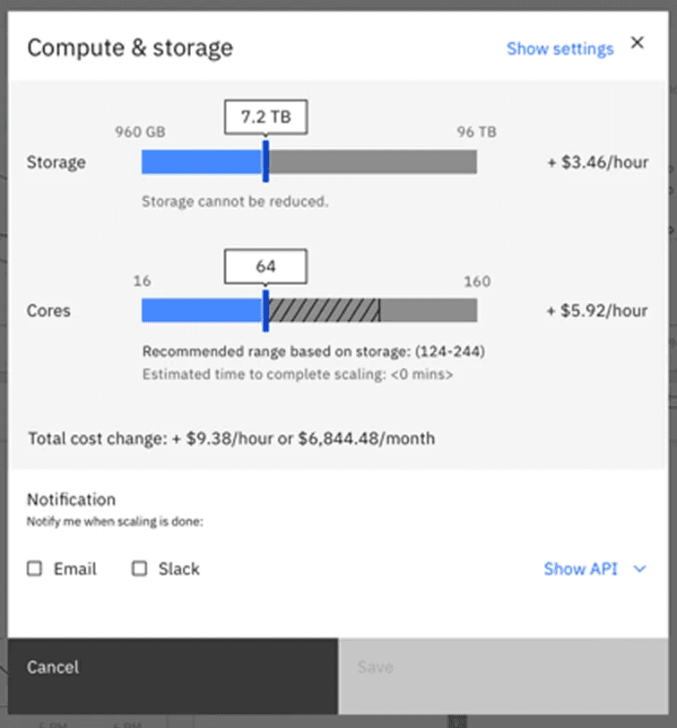
The crown jewel of the redesign was the scaling interface:
Before: Users had to physically call data warehouse hosts, incredibly costly and time-consuming.
After: Drag a slider to see cost/performance implications instantly.
The new interface shows:
Storage and compute sliders with visual feedback.
Real-time cost calculations ($3.46/hour displayed prominently).
Recommended ranges based on current usage.
Email/Slack notifications when scaling is complete.
"Ultimately, I like that it saves costs, which benefits the team. It works!" — Study Participant 15
Implementation
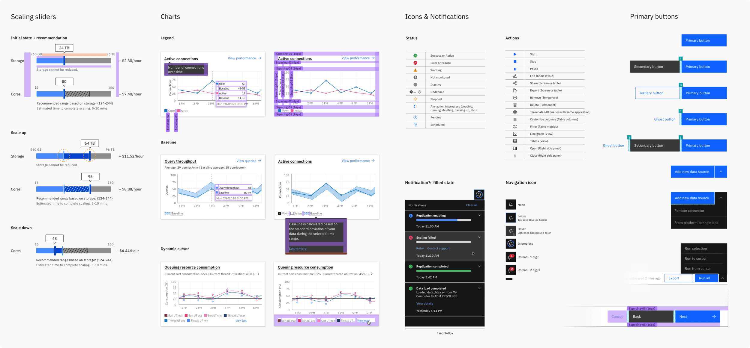
Collaboration Excellence
Working hand-in-hand with engineering, I:
Created detailed specifications.
Participated in daily stand ups.
Conducted design QA before each sprint.
Paired with developers on complex interactions.
Monitoring Dashboard: The Big Picture
Database administrators were drowning in complexity. They had to hunt across multiple screens for critical metrics and — incredibly — still had to phone data centers to adjust resources. I designed a unified dashboard that transformed chaos into clarity.
The Solution: A single-screen command center that surfaces everything administrators need:
Resource consumption visualized in real-time (storage, compute, memory).
Query performance with one-click access to problem queries.
System health indicators that predict issues before they occur.
Drill-down capability — click any metric for instant deep-dive analysis.
"The dashboard gives me a lot more info to work with very quickly. I like that I can see it all as a whole." — Study Participant 13
Scalability
The crown jewel of the redesign was the scaling interface:
Before: Users had to physically call data warehouse hosts, incredibly costly and time-consuming.
After: Drag a slider to see cost/performance implications instantly.
The new interface shows:
Storage and compute sliders with visual feedback.
Real-time cost calculations ($3.46/hour displayed prominently).
Recommended ranges based on current usage.
Email/Slack notifications when scaling is complete.
"Ultimately, I like that it saves costs, which benefits the team. It works!" — Study Participant 15
Implementation
Collaboration Excellence
Working hand-in-hand with engineering, I:
Created detailed specifications.
Participated in daily stand ups.
Conducted design QA before each sprint.
Paired with developers on complex interactions.
Key Experiences
Key Experiences
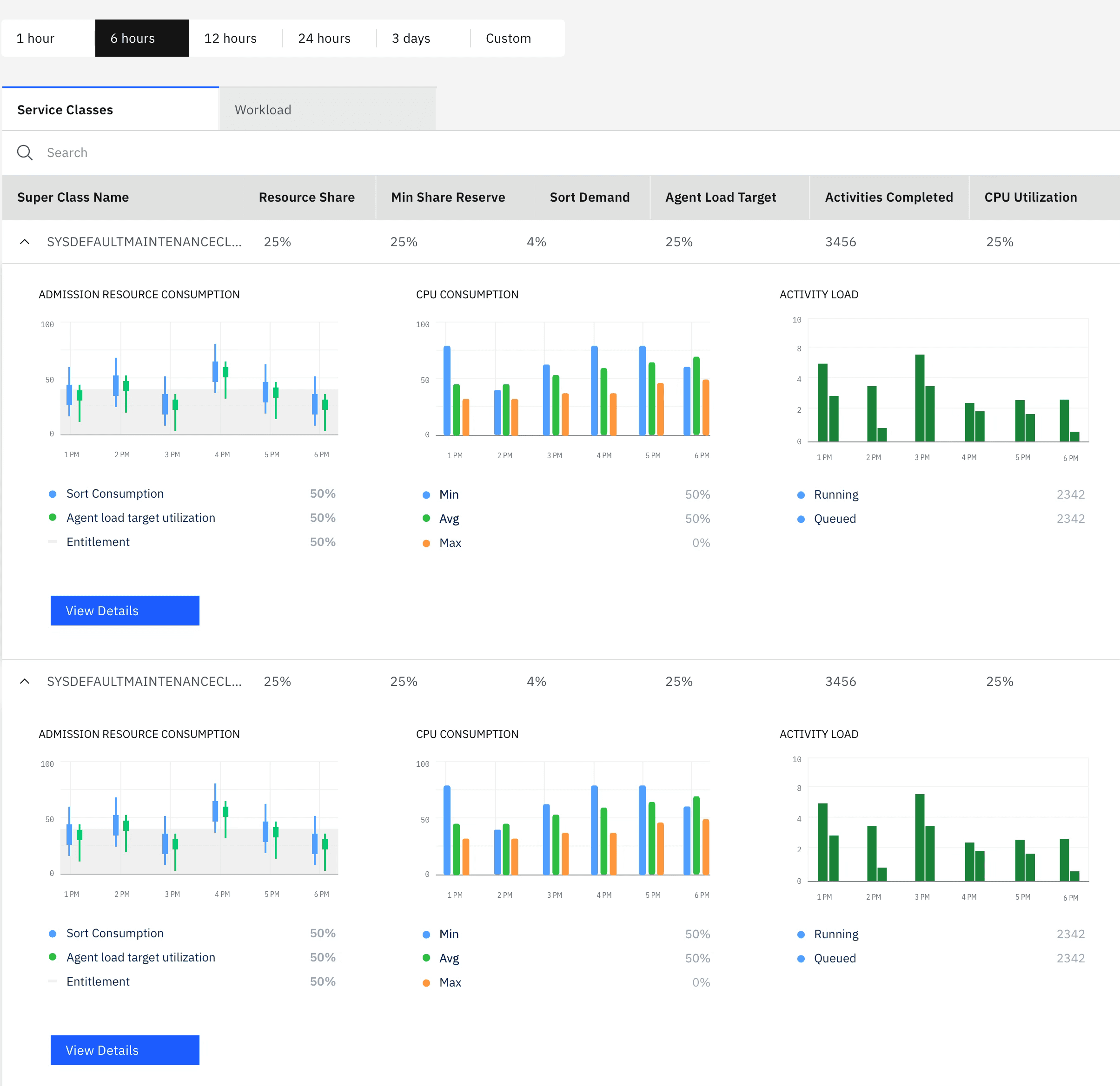
System Health Monitoring
This tool provides a complete, high-level overview of your data system's real-time operations, all on one screen. It allows you to instantly drill down to a specific point in time and take action, removing the need to search across multiple sources. By correlating metrics between charts, the dashboard automatically surfaces key trends and delivers in-depth analysis of all your data views in one unified interface.
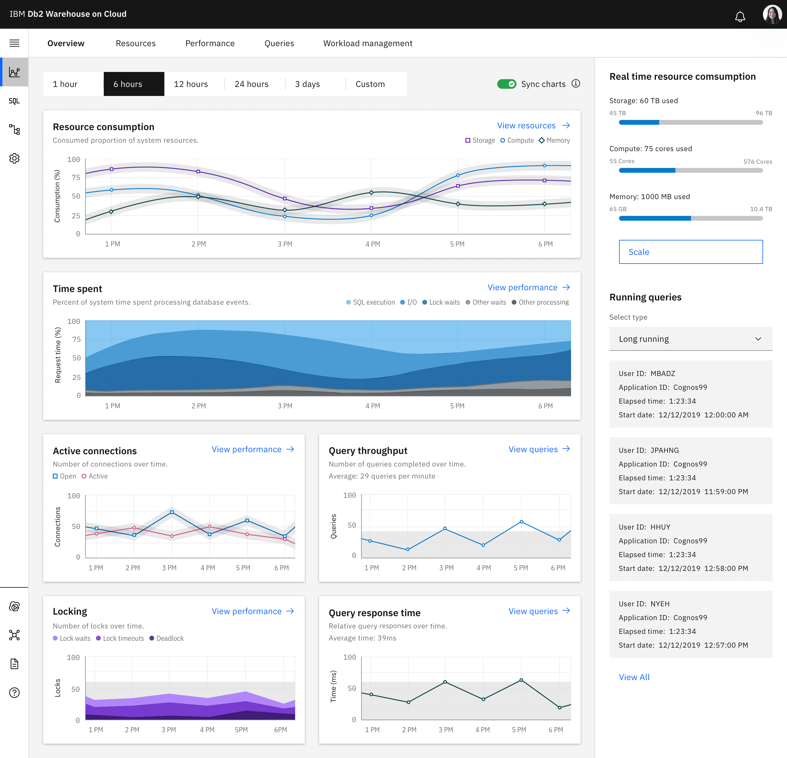
Performance Monitoring
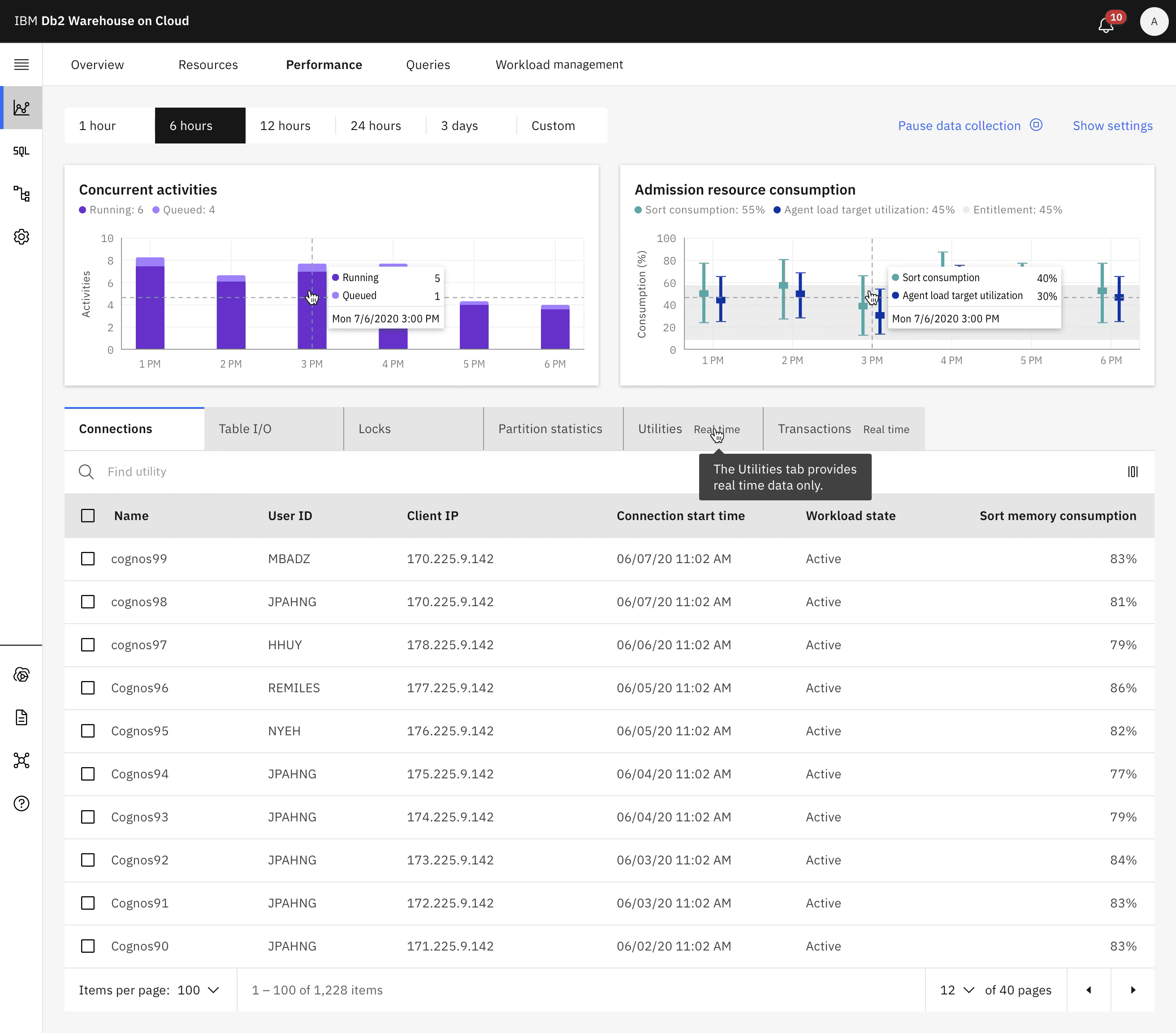
Query Monitoring
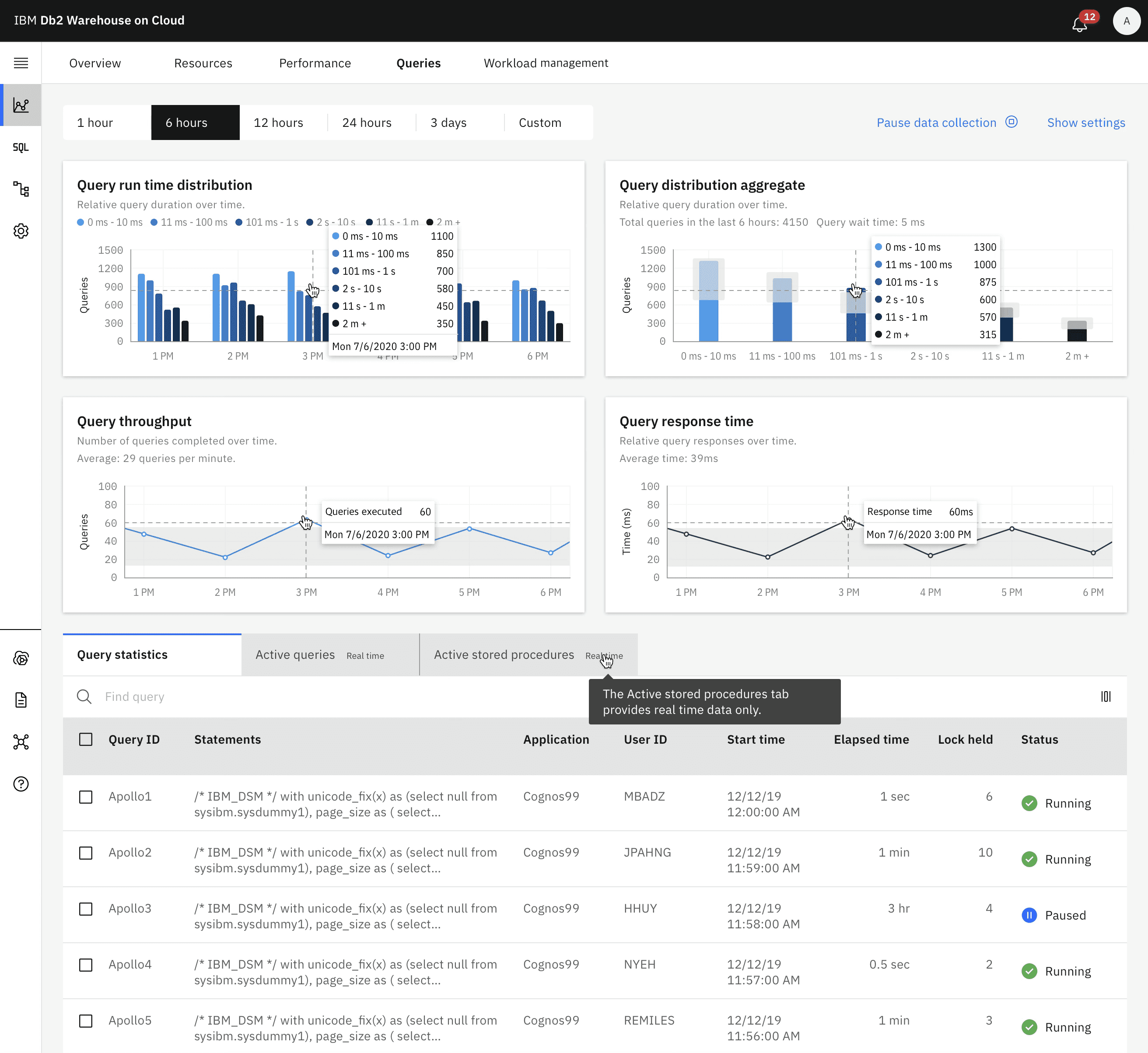
Resource Monitoring
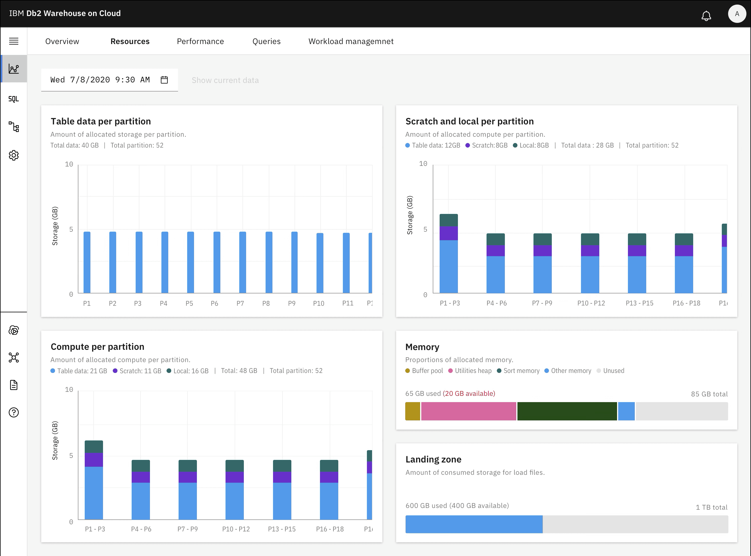
Workload management monitoring
System Health Monitoring
This tool provides a complete, high-level overview of your data system's real-time operations, all on one screen. It allows you to instantly drill down to a specific point in time and take action, removing the need to search across multiple sources. By correlating metrics between charts, the dashboard automatically surfaces key trends and delivers in-depth analysis of all your data views in one unified interface.
Performance Monitoring
Query Monitoring
Resource Monitoring
Workload management monitoring
Results
Results
Business Impact
NPS: -15 → +35 (50-point swing)
Support tickets: 72% reduction (340 → 95 monthly)
Resource scaling time: 82% faster (45 min → 8 min)
25% increase in platform usage
Set new design standard for 5 other IBM Cloud services
Featured case study at IBM Think conference
Business Impact
NPS: -15 → +35 (50-point swing)
Support tickets: 72% reduction (340 → 95 monthly)
Resource scaling time: 82% faster (45 min → 8 min)
25% increase in platform usage
Set new design standard for 5 other IBM Cloud services
Featured case study at IBM Think conference
Recognition
Recognition